FOAM
Branding / Bodycare Brand
February 2024
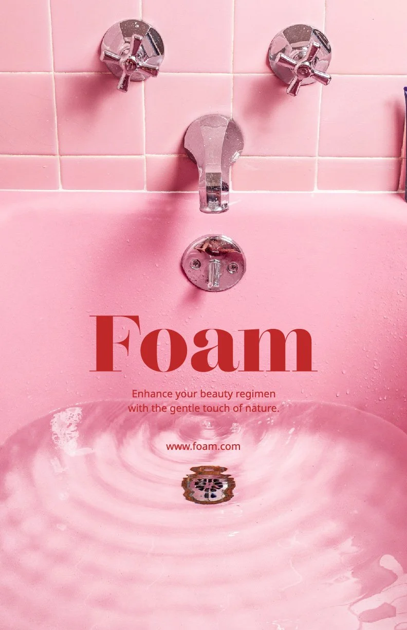
Enhance your beauty regimen
with the gentle touch of nature
About Brand
Foam embodies more than just a body care brand; it's a philosophy of self-care and indulgence. We believe in the transformative power of natural ingredients to nourish and revitalize the skin, leaving it feeling soft, smooth, and radiant. Our carefully crafted products are gentle yet effective, ensuring a luxurious experience. From lush body butters to soothing lip treatments, our range offers a sensory journey that turns everyday routines into moments of pure bliss.
Design Concept
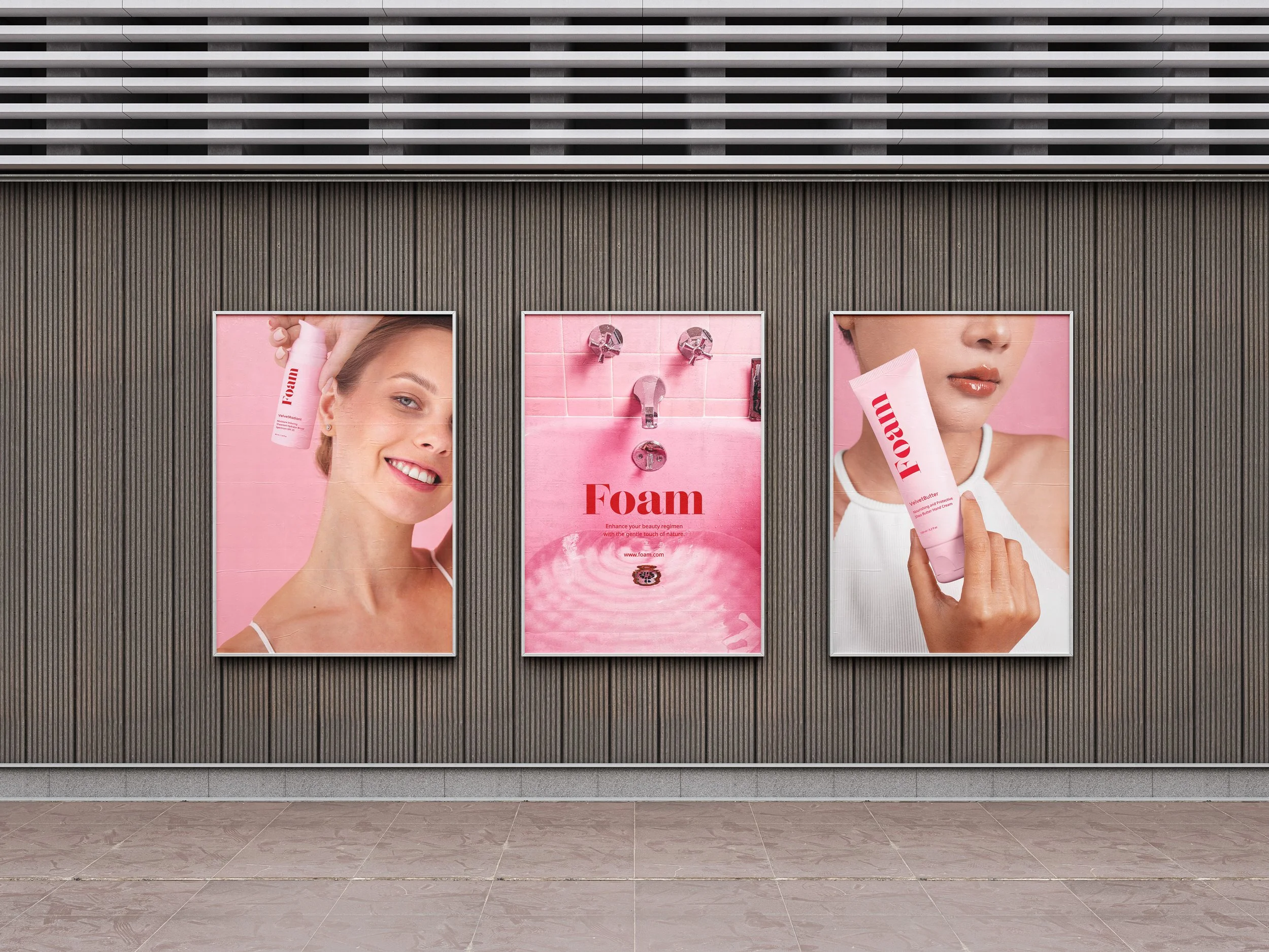
Foam's design seamlessly merges elegance with modernity, inspired by timeless red and pink hues. These colors evoke vitality, passion, and femininity, reflecting the brand's commitment to natural beauty and self-care. Minimalistic layouts add sophistication, while a blend of serif and sans-serif fonts balances tradition with contemporary style. Together, they invite customers into a world of luxury, defining "Foam" as the epitome of aesthetic excellence in body care.
Logo Design

For Foam's logo design, I opted for a simple yet elegant approach, utilizing the Lust Didone font to convey a sense of femininity and sophistication. The font's delicate serifs and graceful curves perfectly encapsulate the brand's philosophy of self-care and indulgence. To further enhance the logo's appeal, I manually thickened the serifs using the direct selection tool in Illustrator, ensuring that every detail exudes refinement and charm.
In addition to the typography, I introduced a matching logo icon, where the letter 'f' is nestled within a red flower shape. This iconic element adds a touch of whimsy and versatility to the branding, allowing for seamless integration across various marketing materials and packaging designs. By combining simplicity with meticulous customization, Foam's logo embodies the brand's commitment to delivering luxurious and effective body care products while captivating the hearts of our target audience with its timeless elegance.
Colour Palette
MONZA
#D30024
PASTEL PINK
#FFD9E1
WHITE
#FFFFFF
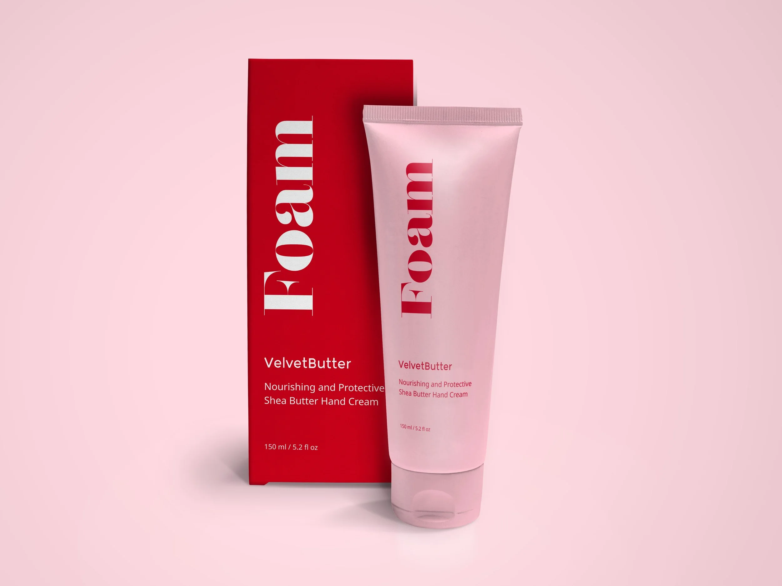
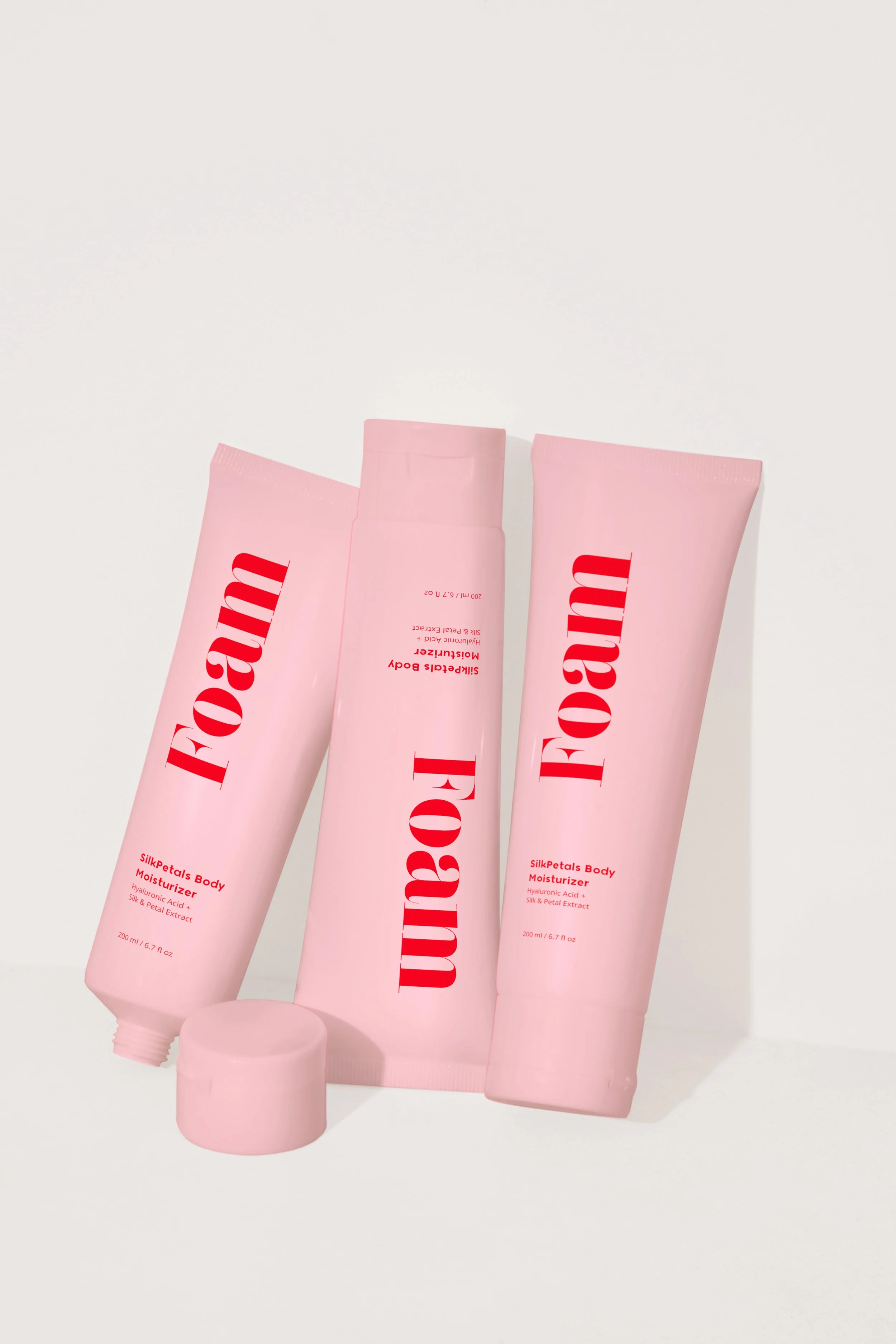
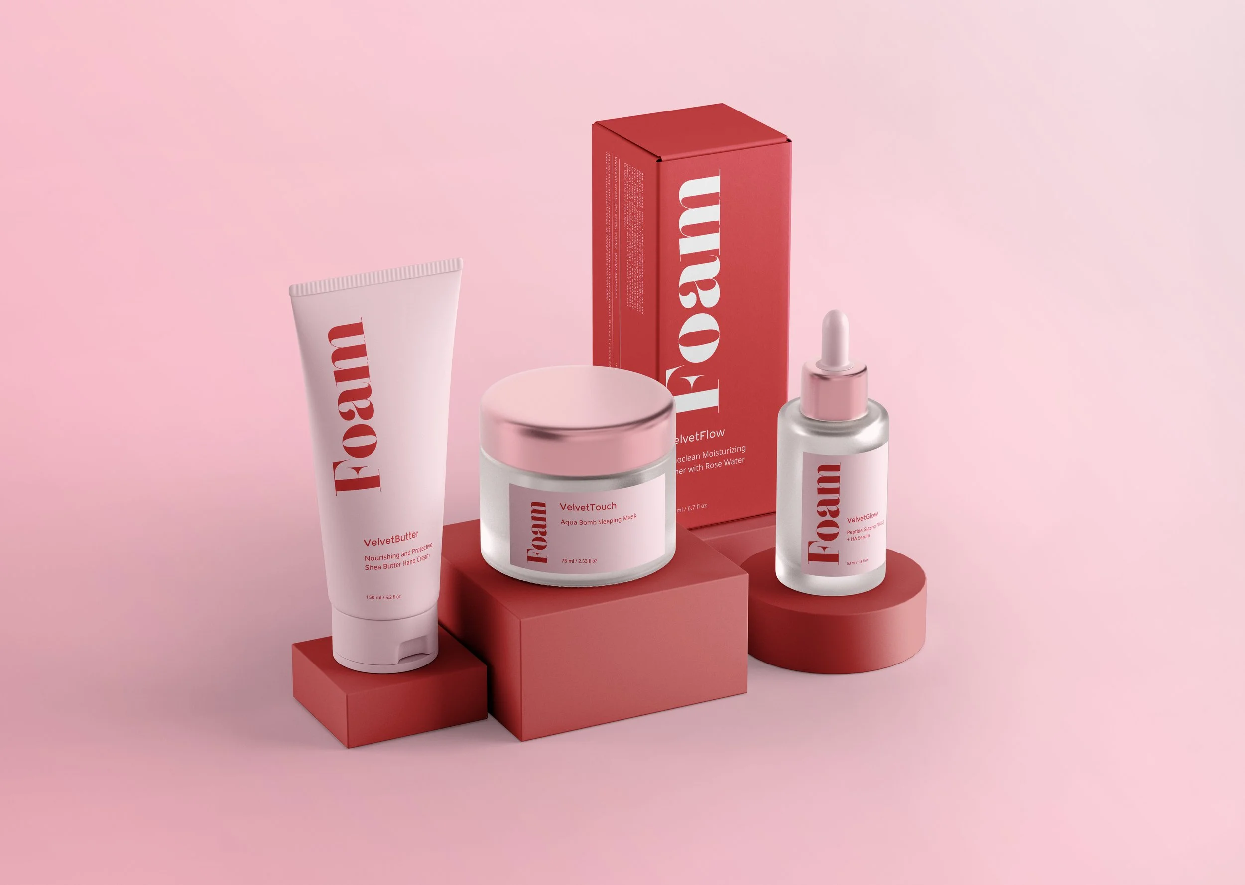
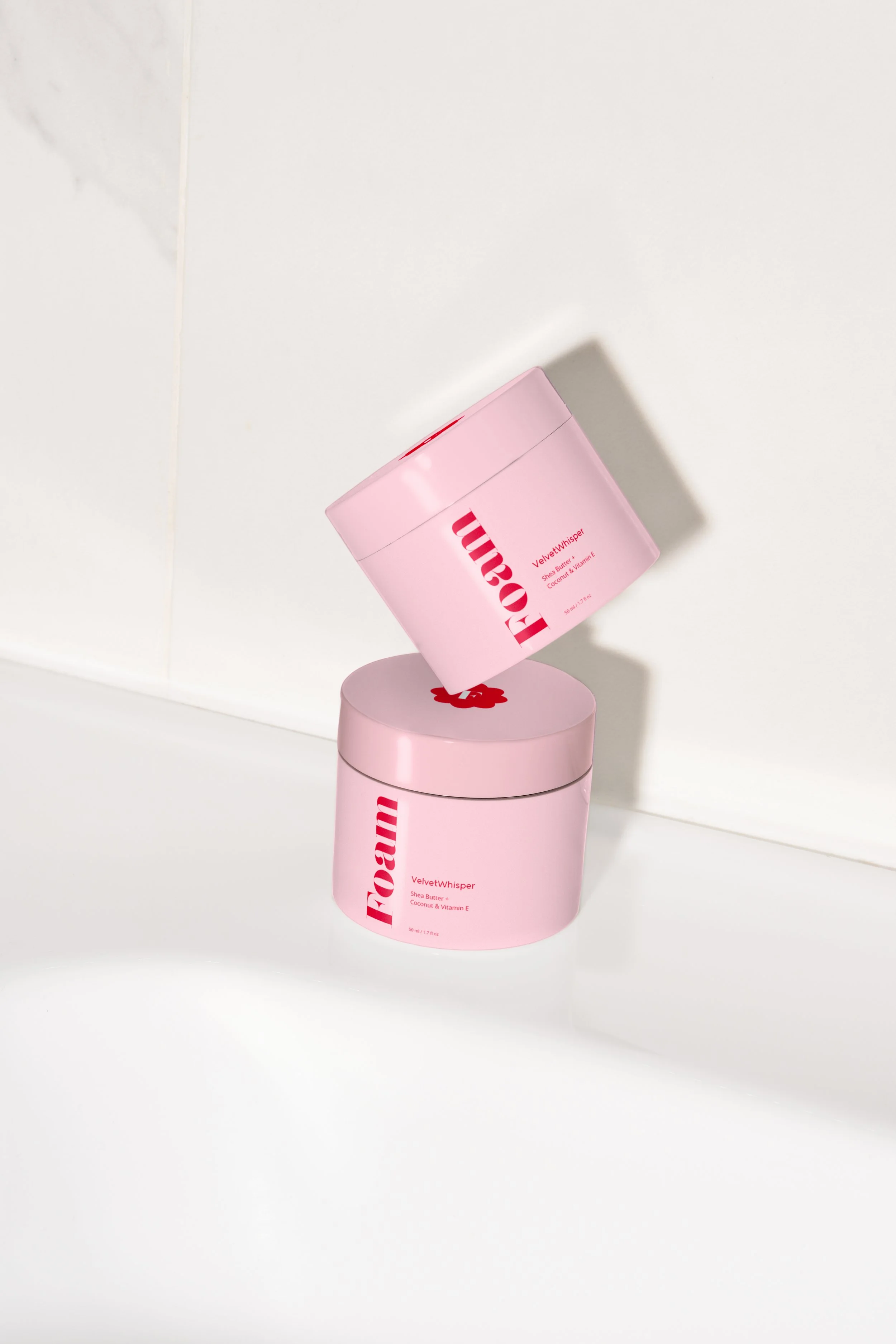
Packaging Design
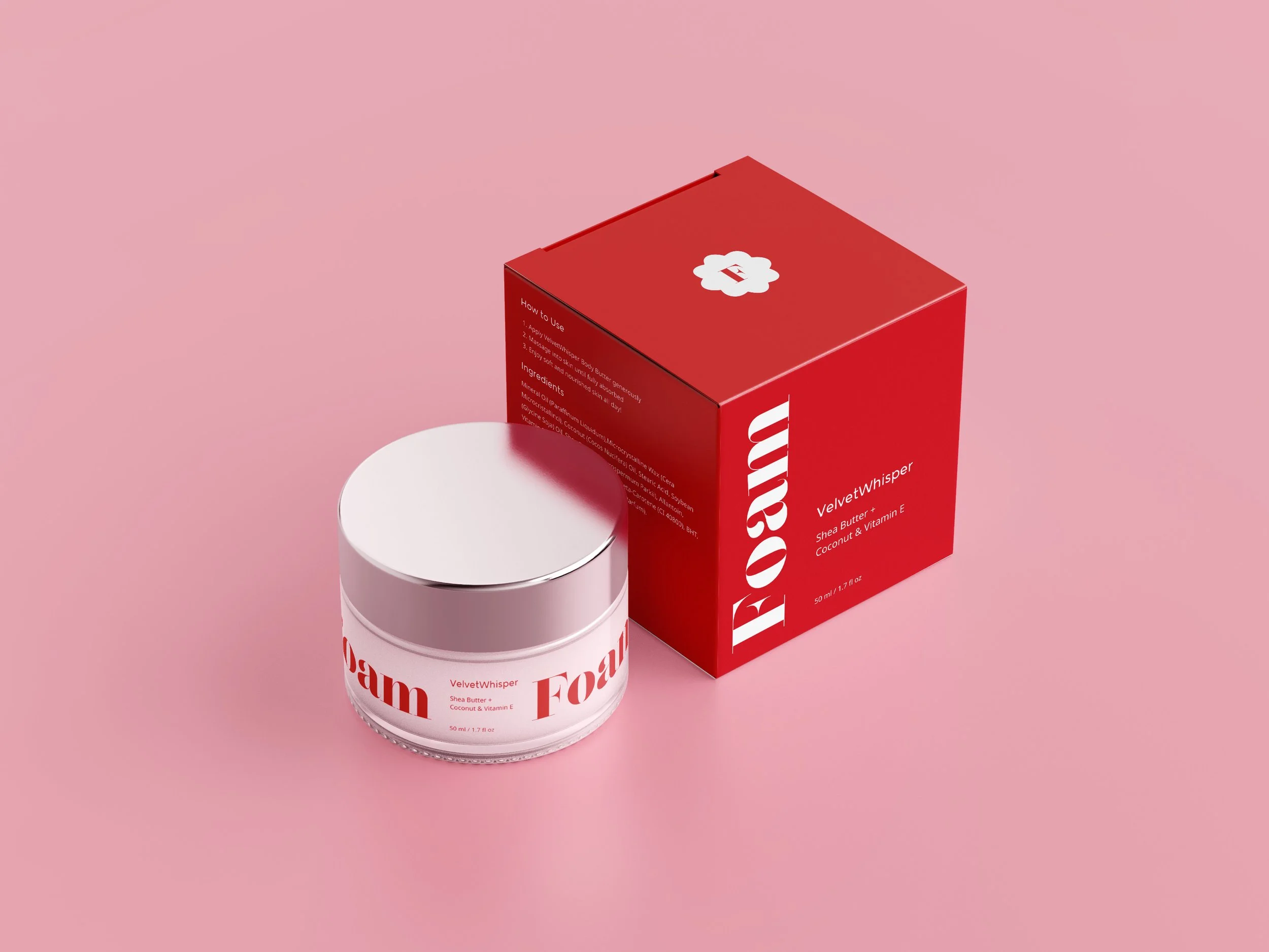
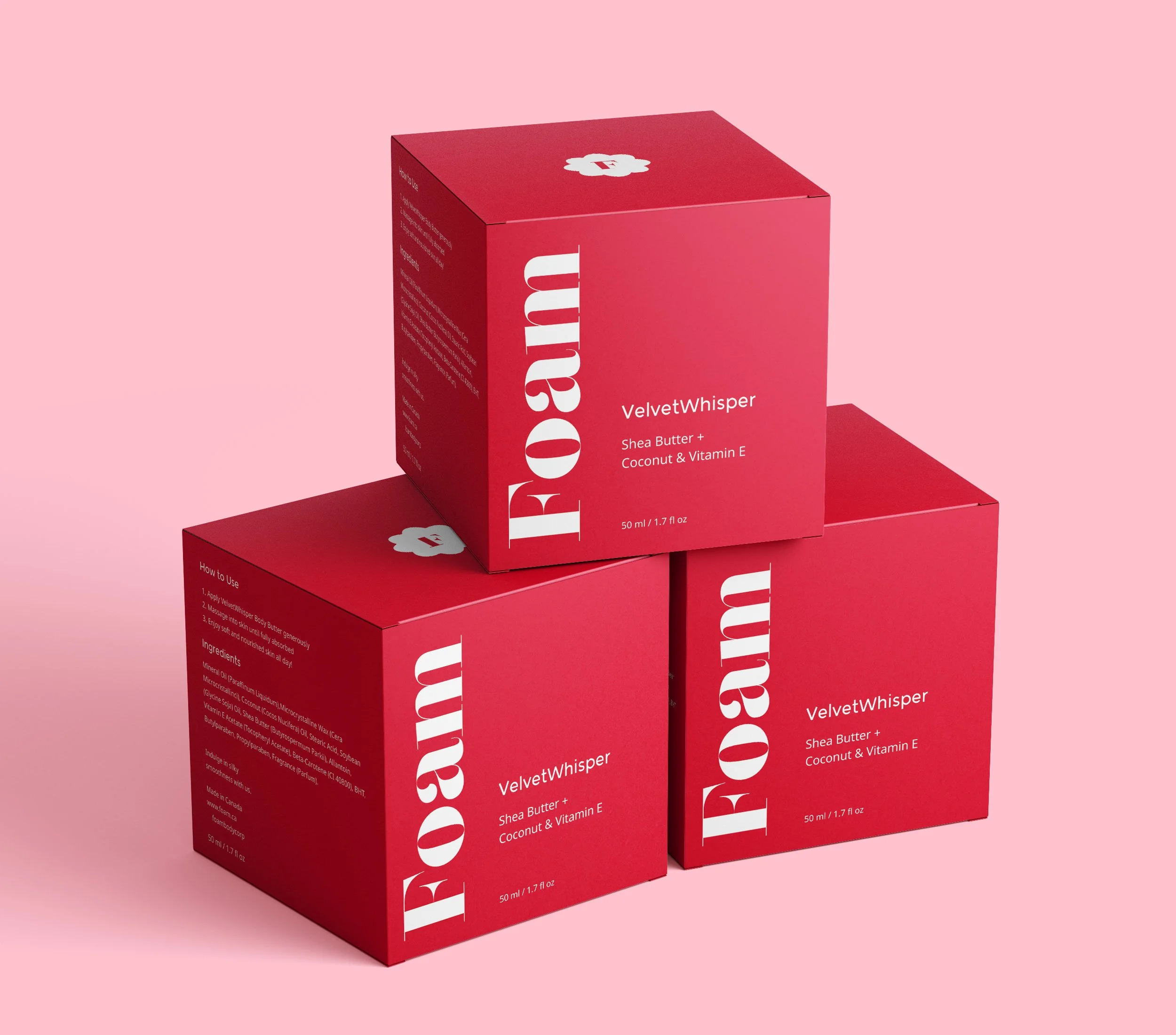
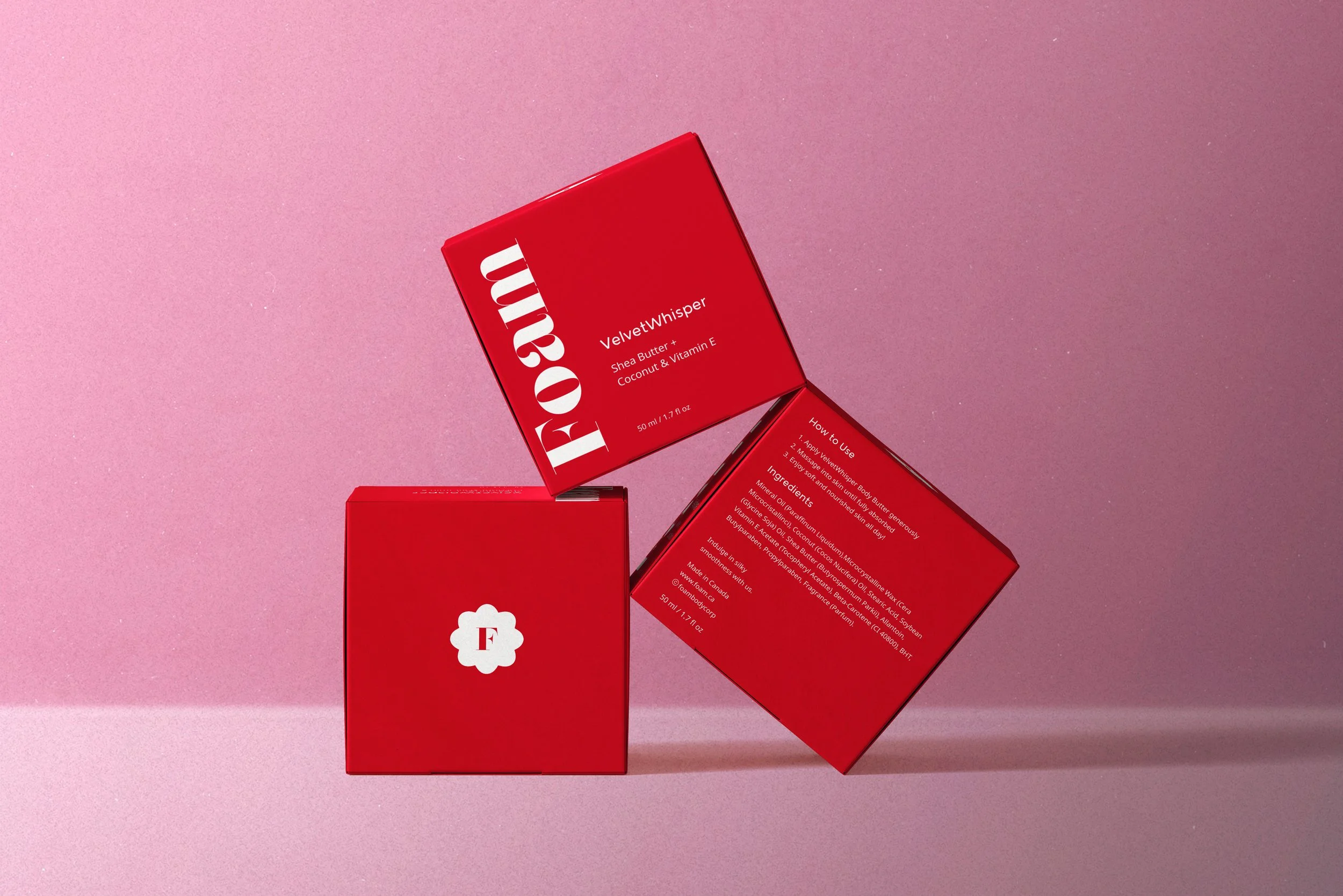
In designing Foam's packaging, I aimed to create a visual experience that is both elegant and captivating. Drawing inspiration from the brand's philosophy of self-care and indulgence, I incorporated red, white, and pink hues to evoke vitality, passion, and femininity. The use of the Lust Didone font, with its thickened serifs, adds a touch of sophistication and modernity to the design.
My decision to keep the packaging minimalistic was driven by the desire to cater to the preferences of our target audience, primarily women, who appreciate simplicity and clarity in product presentation. I understand that in today's fast-paced world, consumers value convenience and efficiency. Therefore, I ensured that the packaging design not only looks visually appealing but also communicates essential information effectively.
Each package features the Foam logo prominently, accompanied by a brief description of the product inside and clear instructions on how to use it. Additionally, the ingredients section on the side provides transparency and reassurance to our customers, allowing them to make informed choices about their skincare routine.
By combining aesthetics with functionality, my packaging design serves as a visual representation of Foam's commitment to providing luxurious and effective body care products. It captures the attention of our target audience while also offering a seamless and enjoyable user experience.


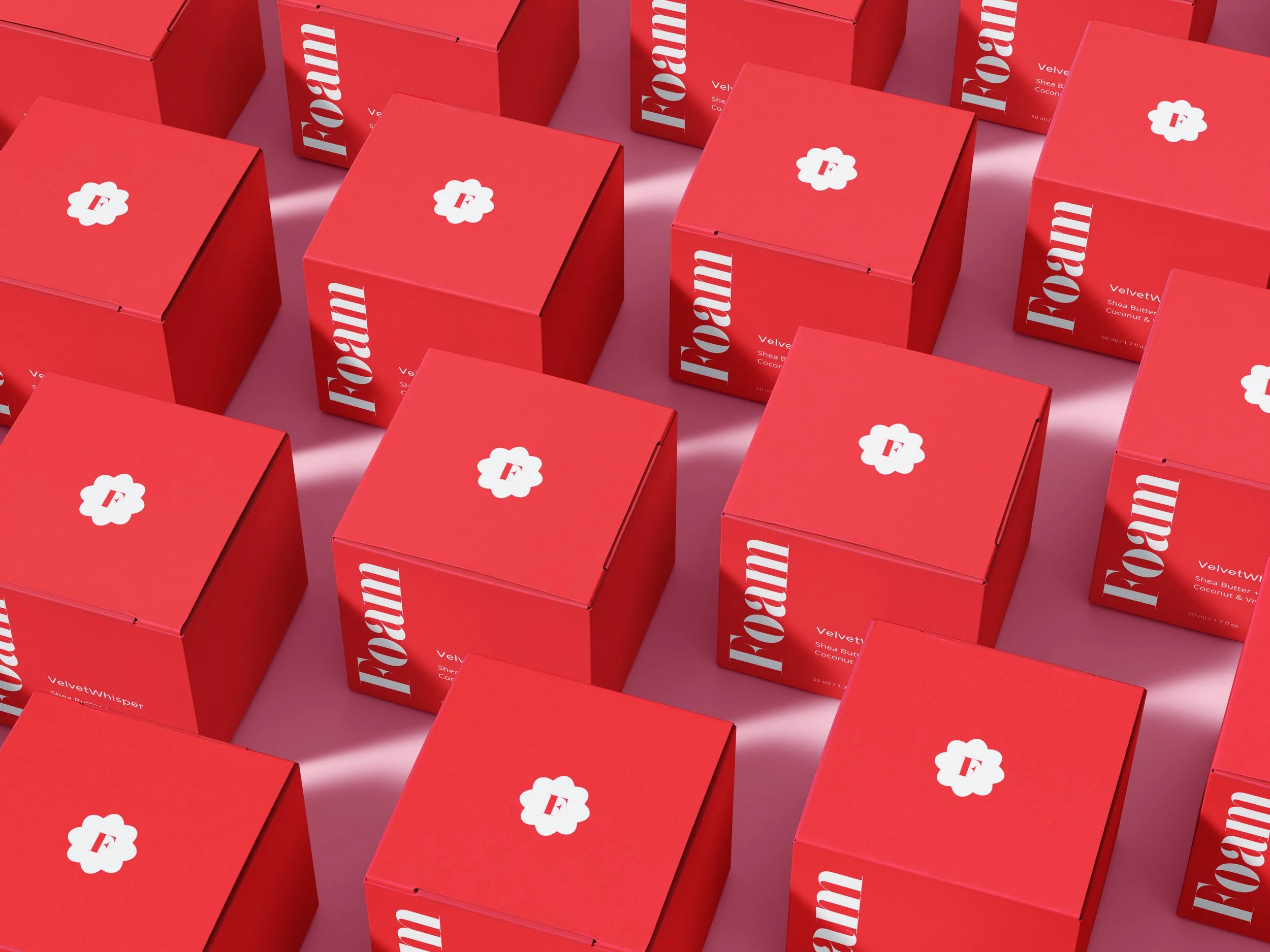

Here's the box packaging design I created for Foam's body butter. It's bold in red, with the brand's logo prominently displayed. Inside, you'll find a how-to guide, ingredients list, and origin info. It's all about clearly showcasing the product with a detailed description and complete volume measurement (fl/oz).

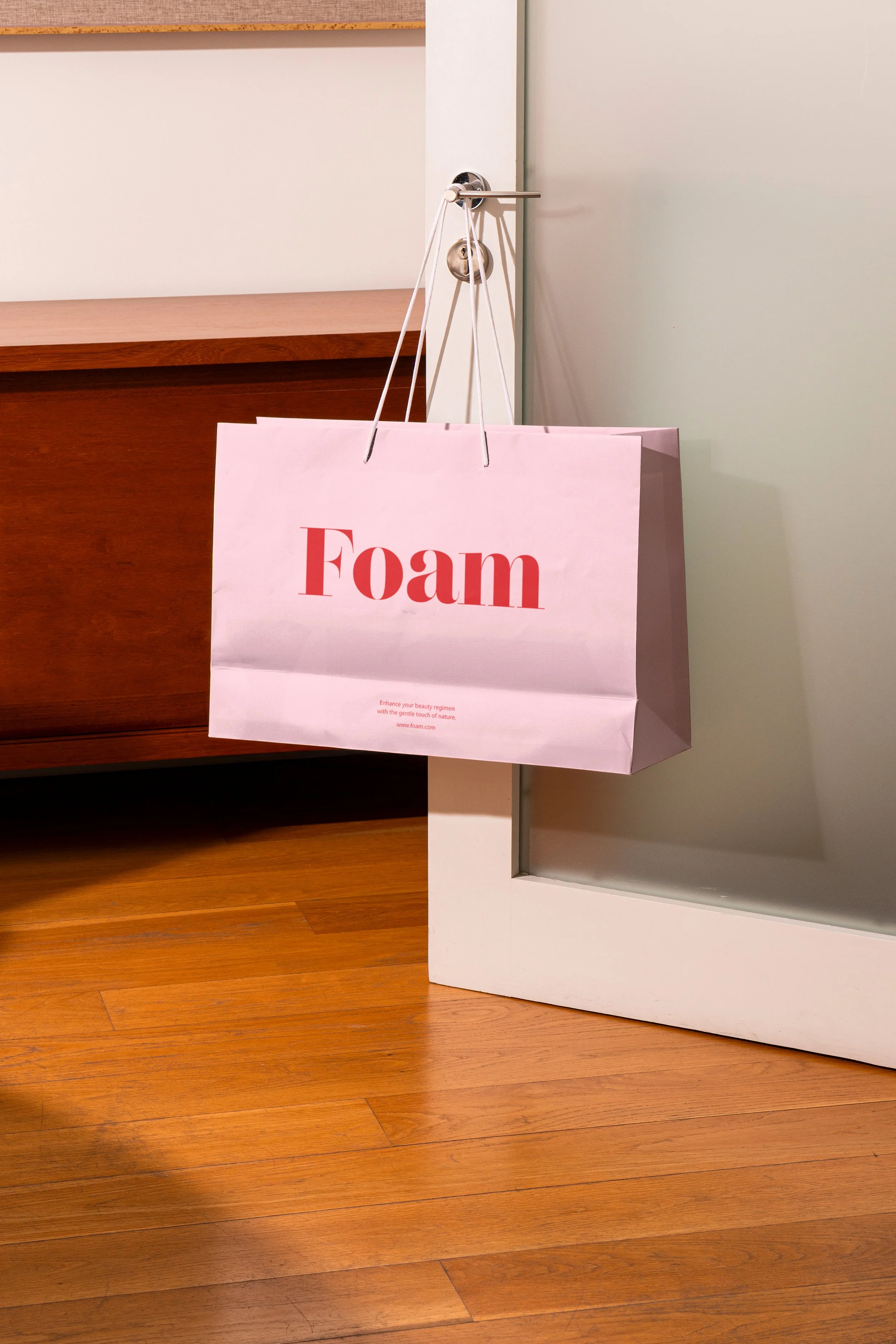
Foam's shopping bag: simple, yet captures the brand's essence with elegance and minimalism.